Anneli Torres
My practice covers executive presentations, data visualization, information storytelling, editorial design, corporate reports, brand systems, and document accessibility.
These case studies document the decisions behind the finished work: how I frame a problem, structure information, work within constraints, and evaluate what changed.
20+ years of experience across global finance, government institutions, NGOs, and international initiatives.
Selected Case Studies
In-depth examples of how I approach complex communication, design systems, data visualization, accessibility, and measurable institutional outcomes.
The Investment Grade
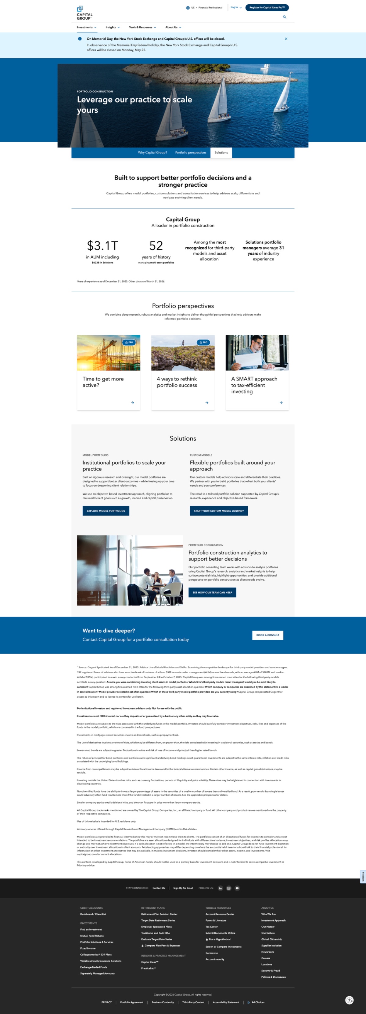
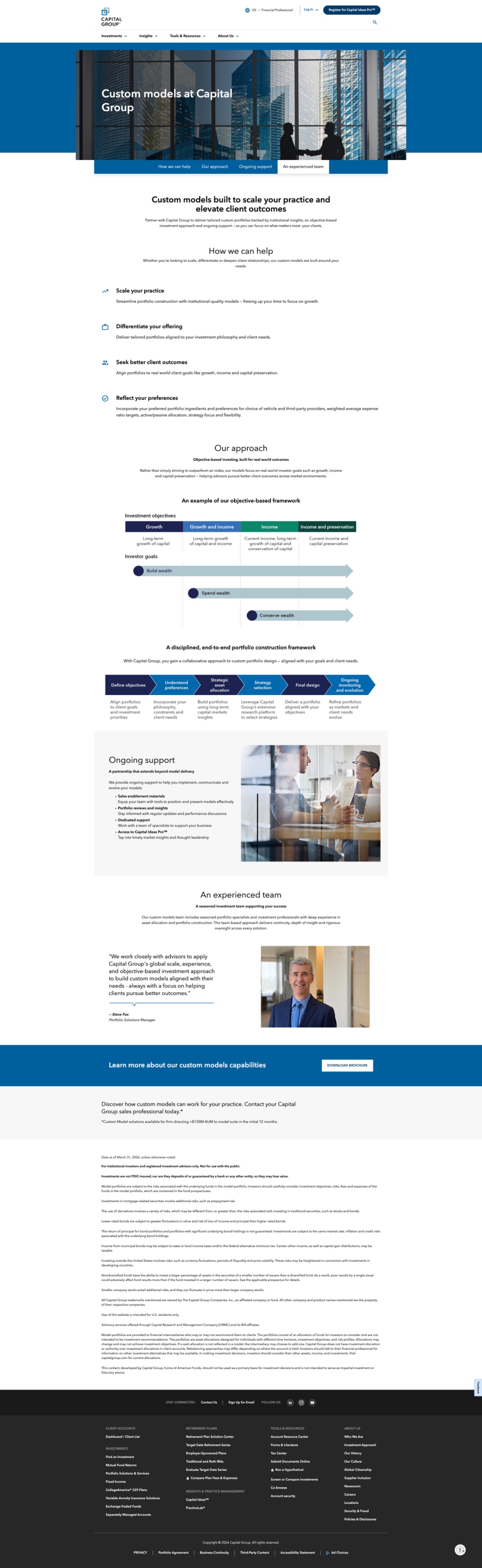
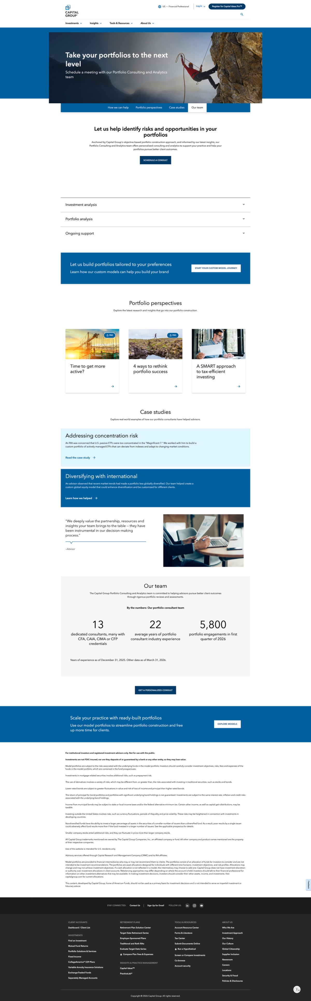
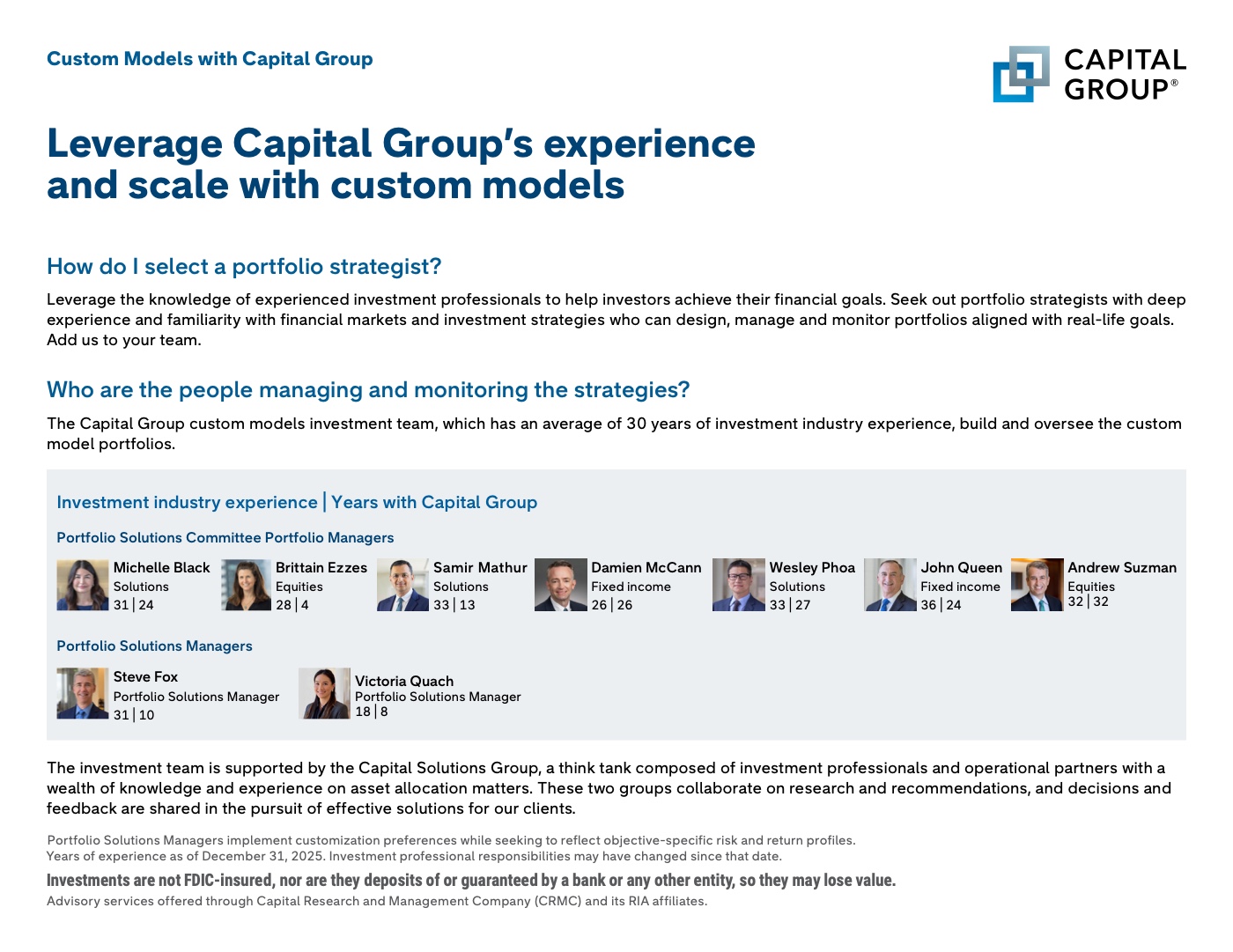
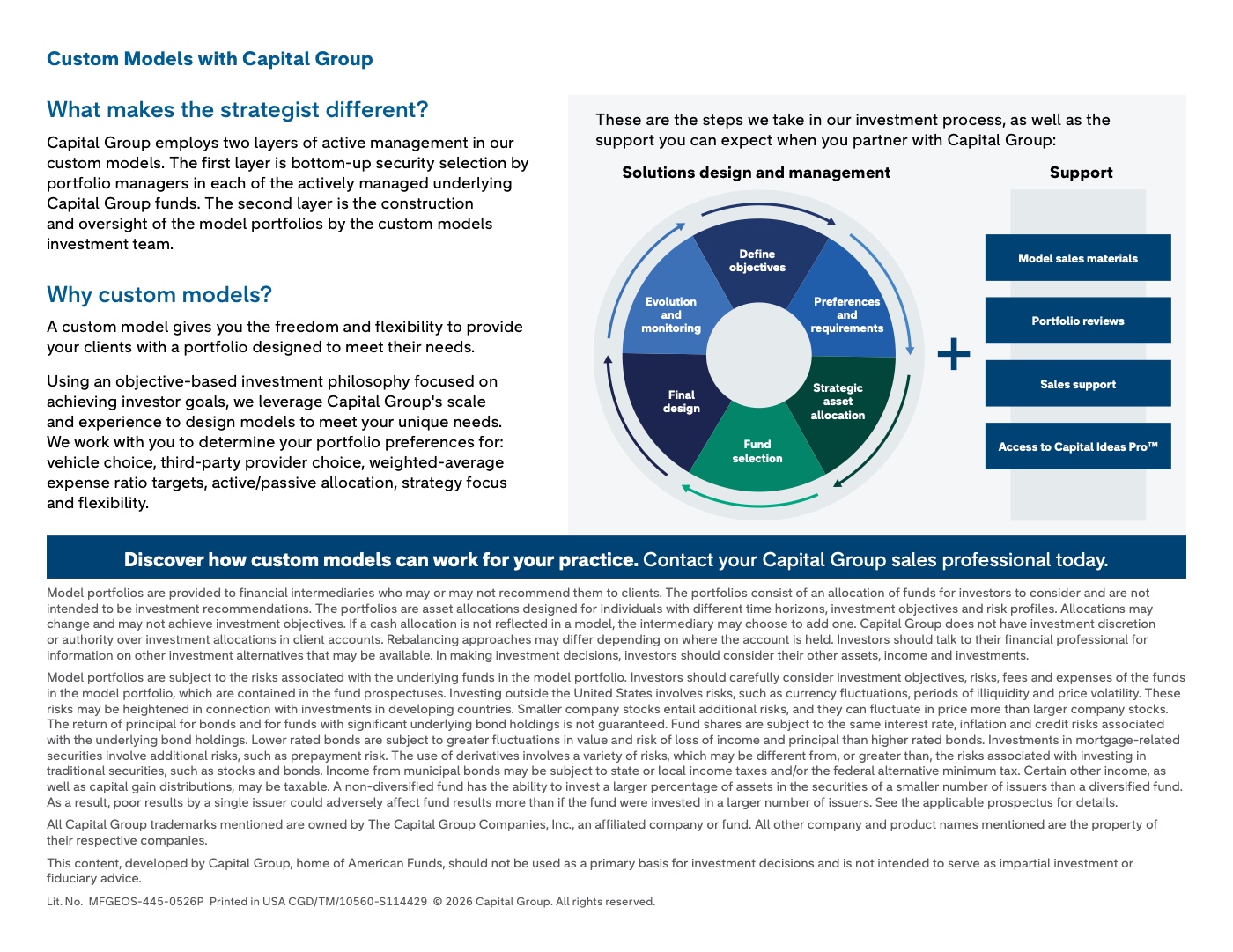
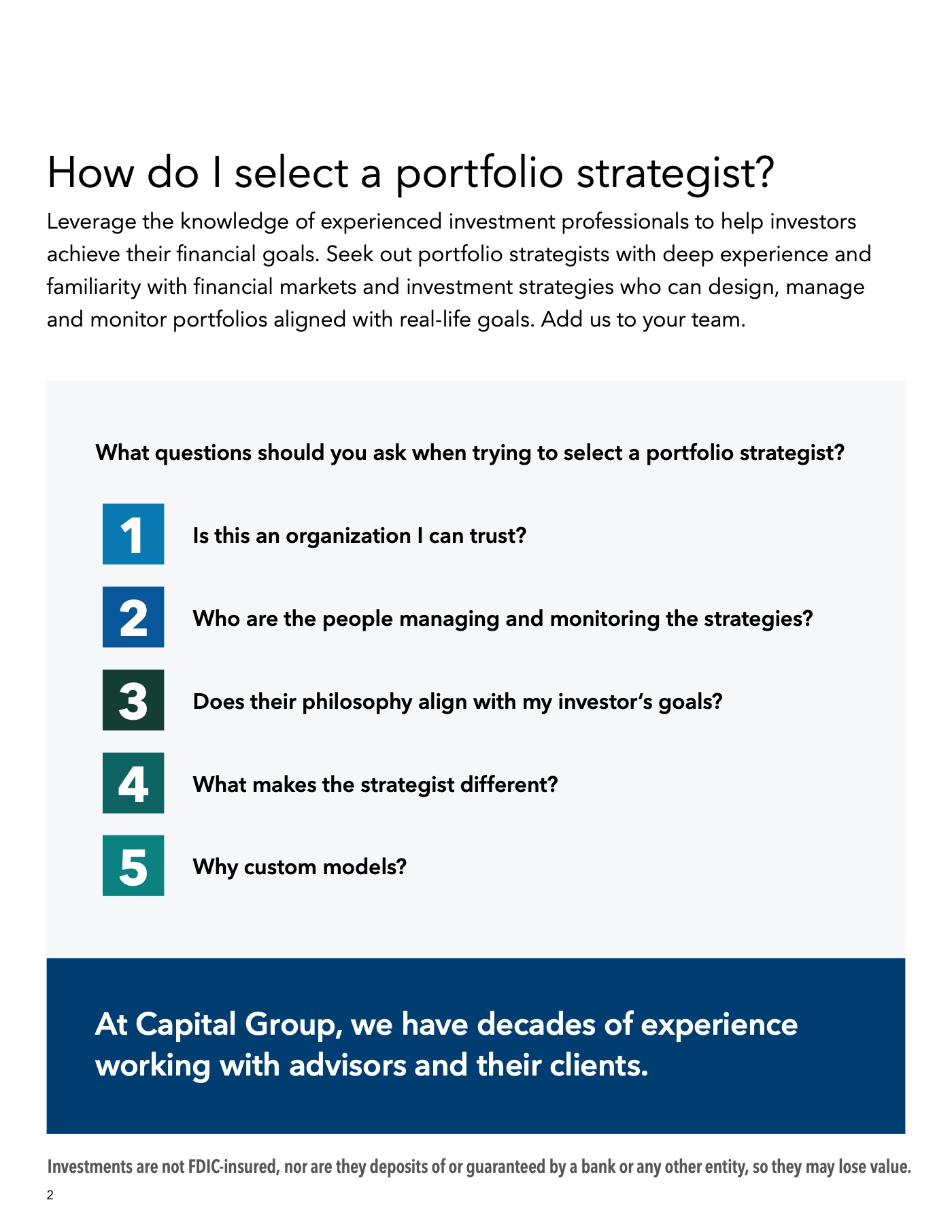
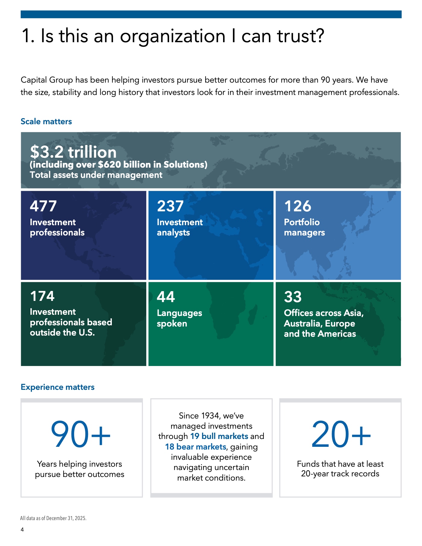
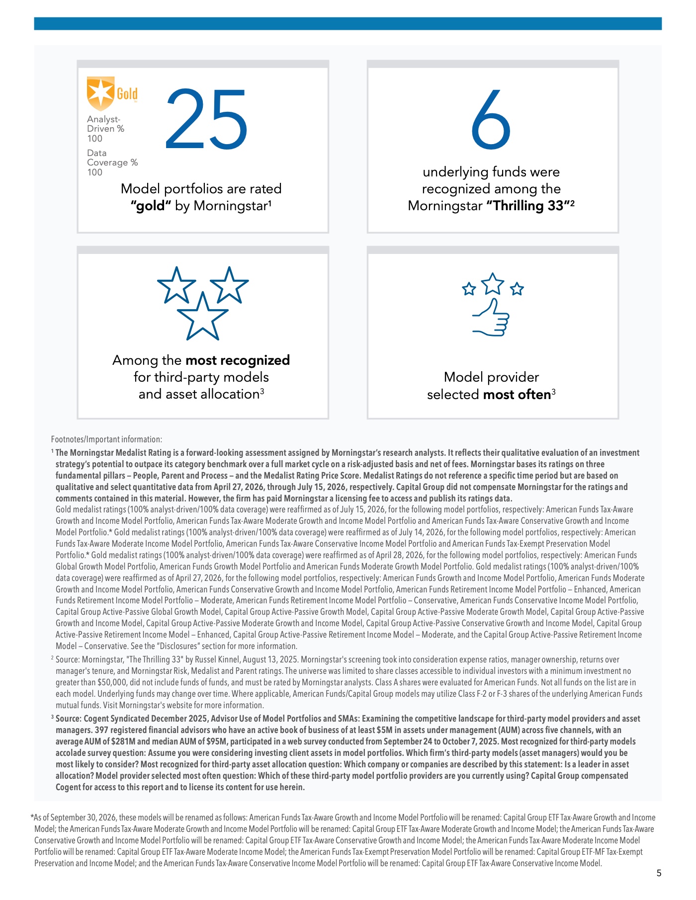
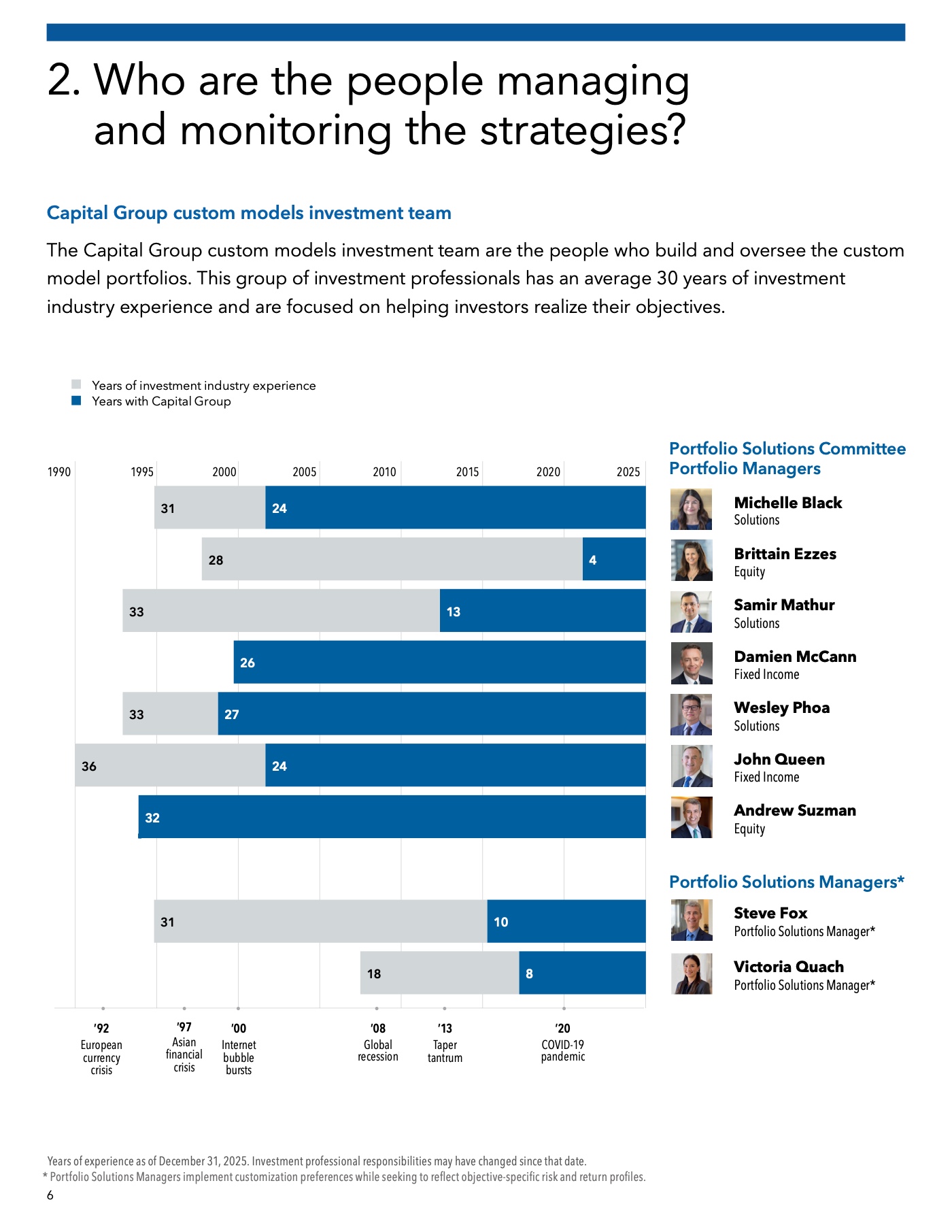
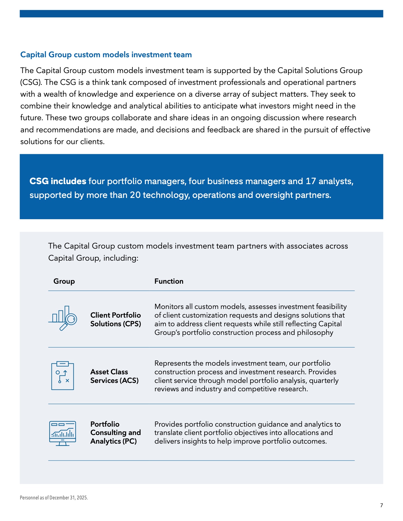
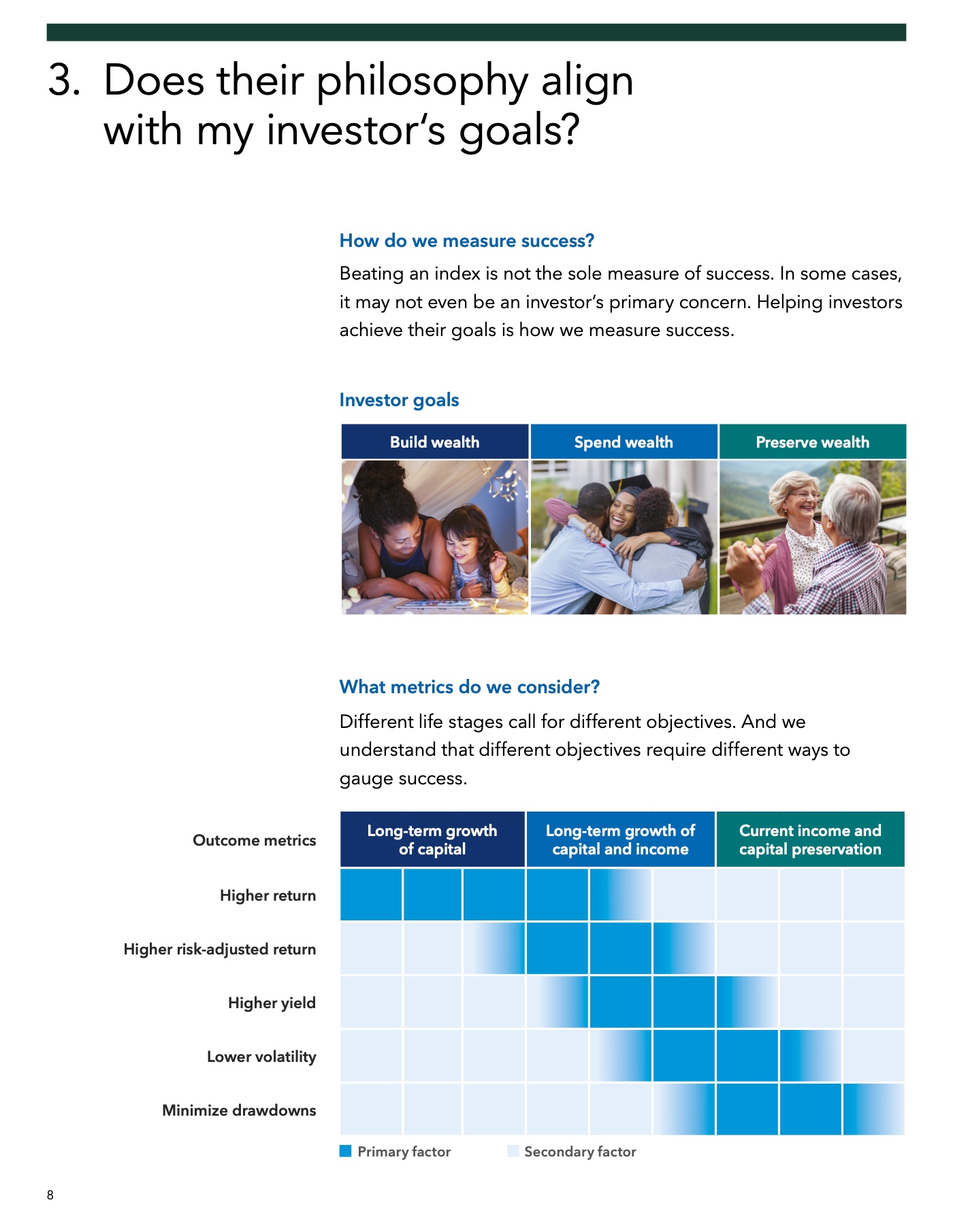
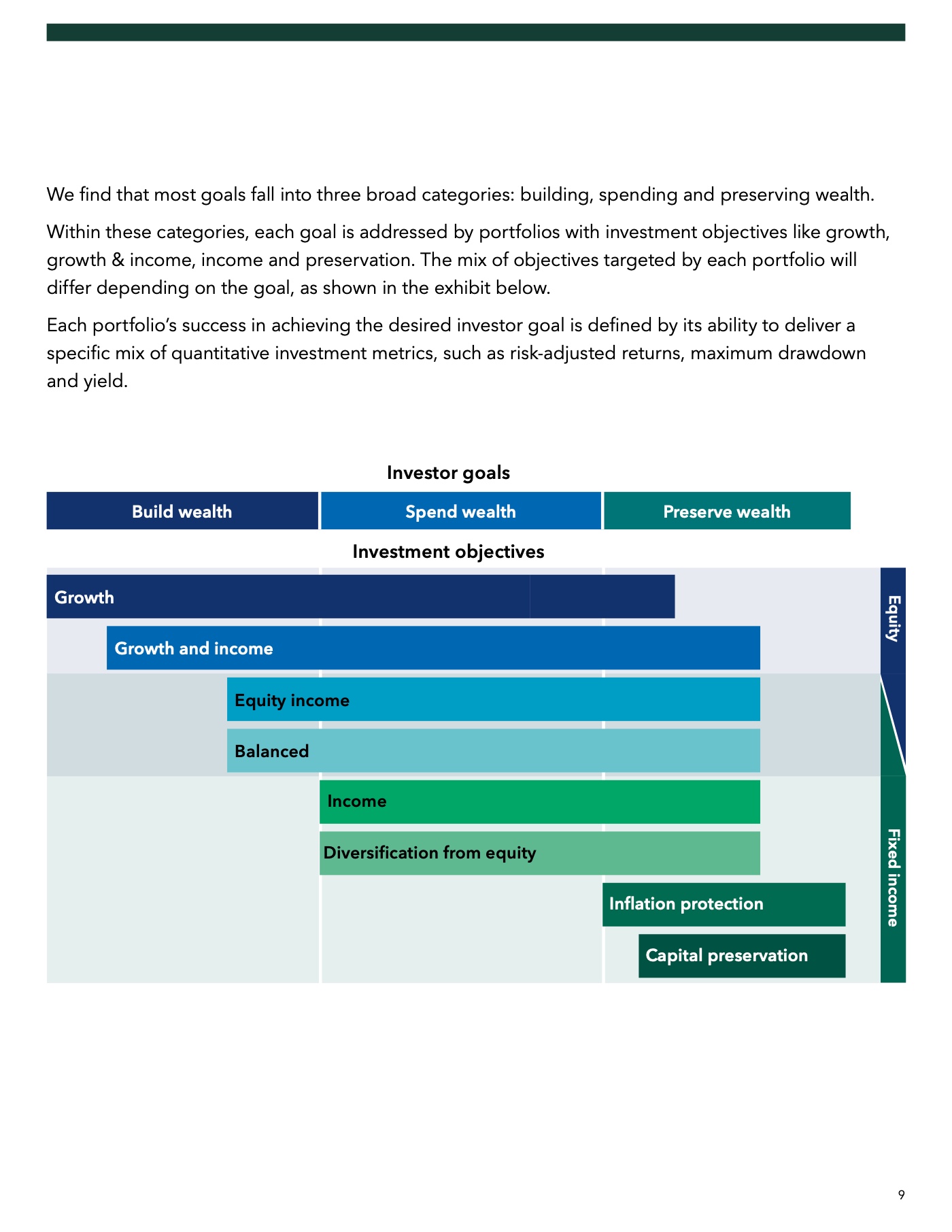
Five advisor-facing deliverables across web and print — designed to the same institutional standard a $2.6T asset manager expects from its own brand.
Problem
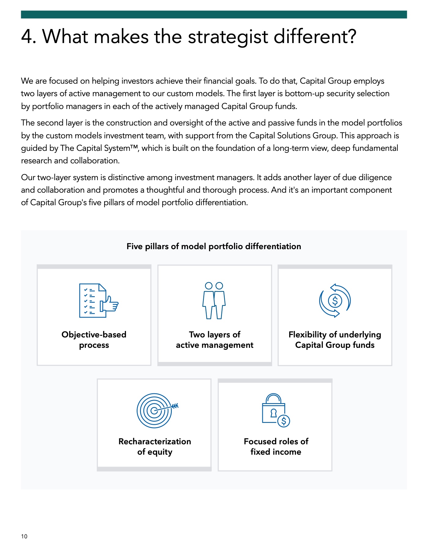
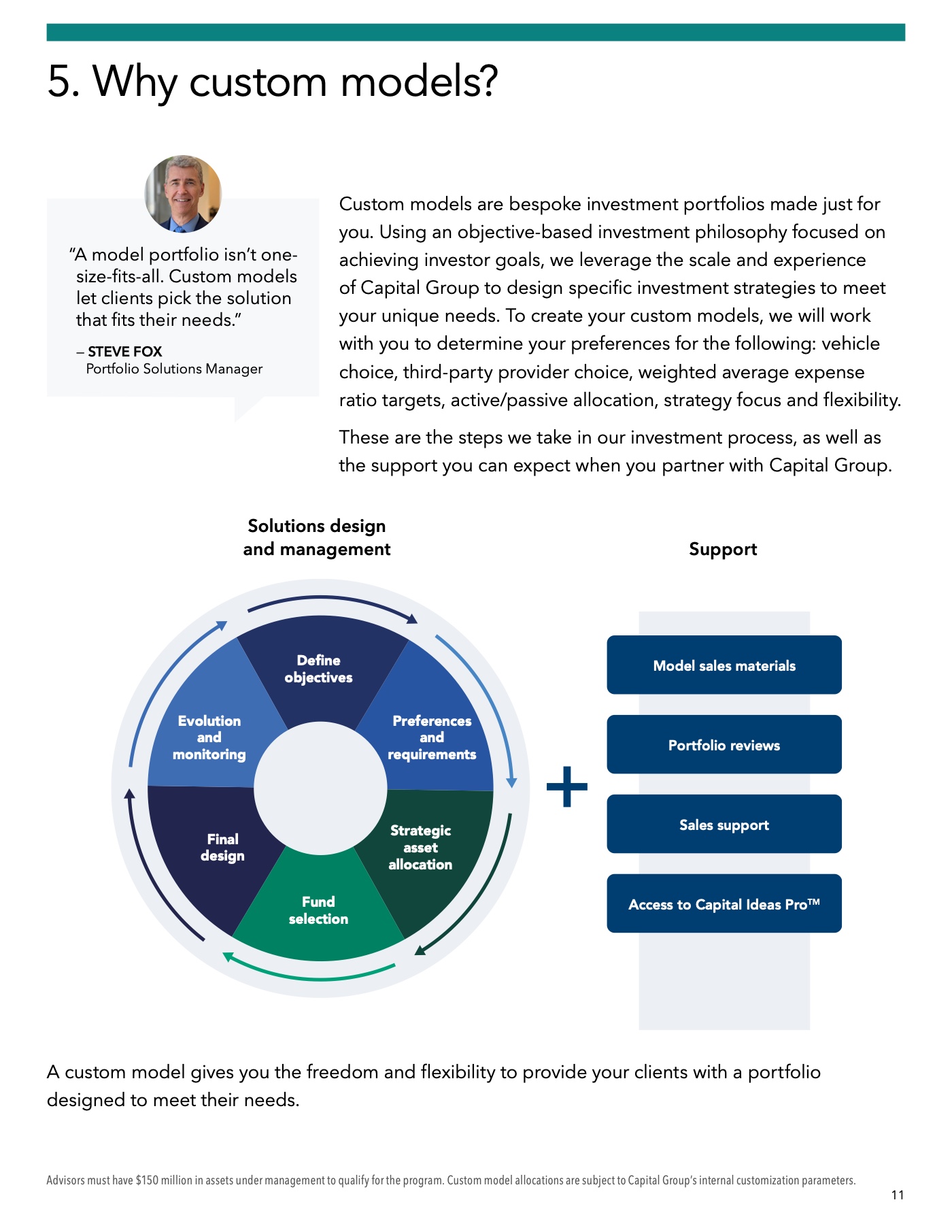
Capital Group needed advisor-facing portfolio construction content shipped across web and print — three landing pages and two long-form publications. Web surfaces had to land precisely on the firm's component library and brand system. The publications, distributed widely to retail shareholders, had to meet ADA / Section 508 accessibility standards before they could be filed.
Approach
Web pages authored in Figma using Capital Group's institutional component library — brand-compliant by construction, no off-system patterns. Long-form publications built in InDesign with full accessibility production: tagged structure, alt-text on every figure, deliberate reading order, table semantics, and structured-PDF export verified against WCAG-AA.
Results





The Precision System
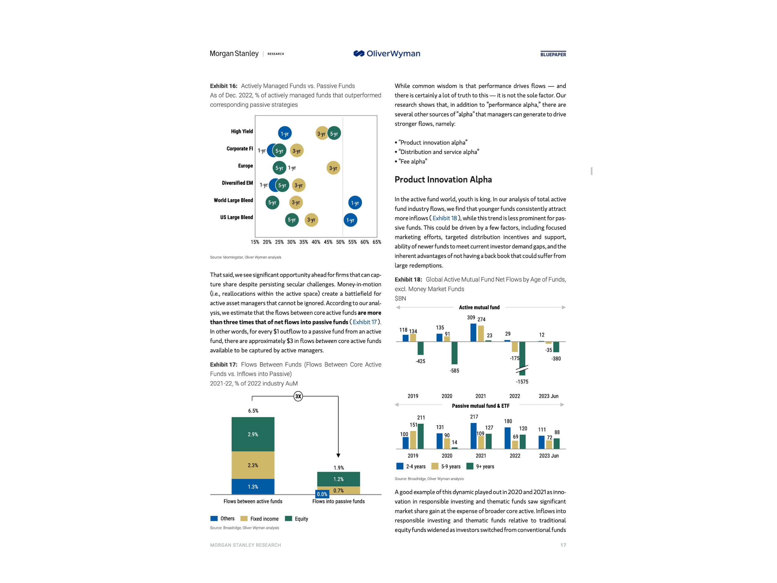
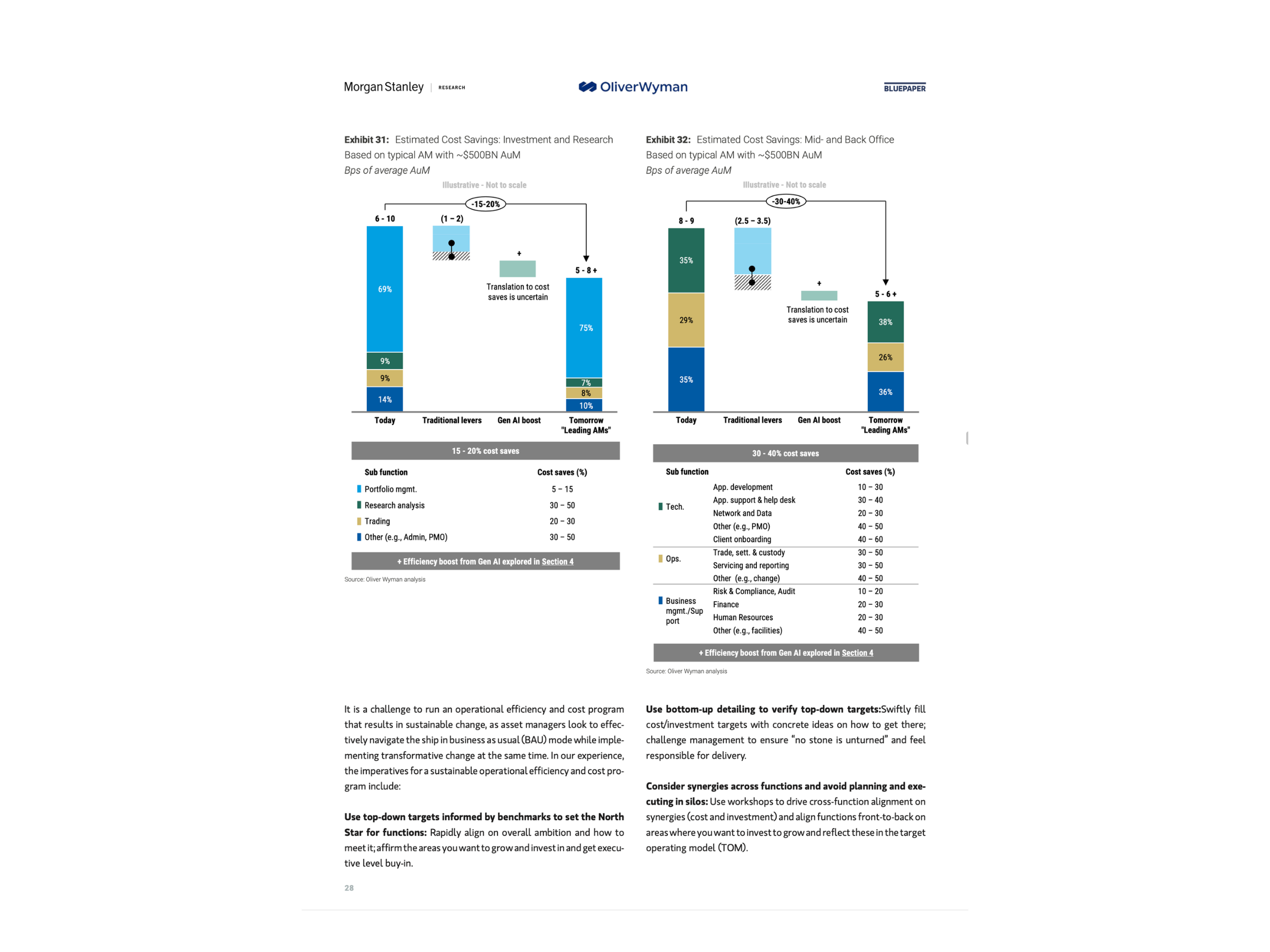
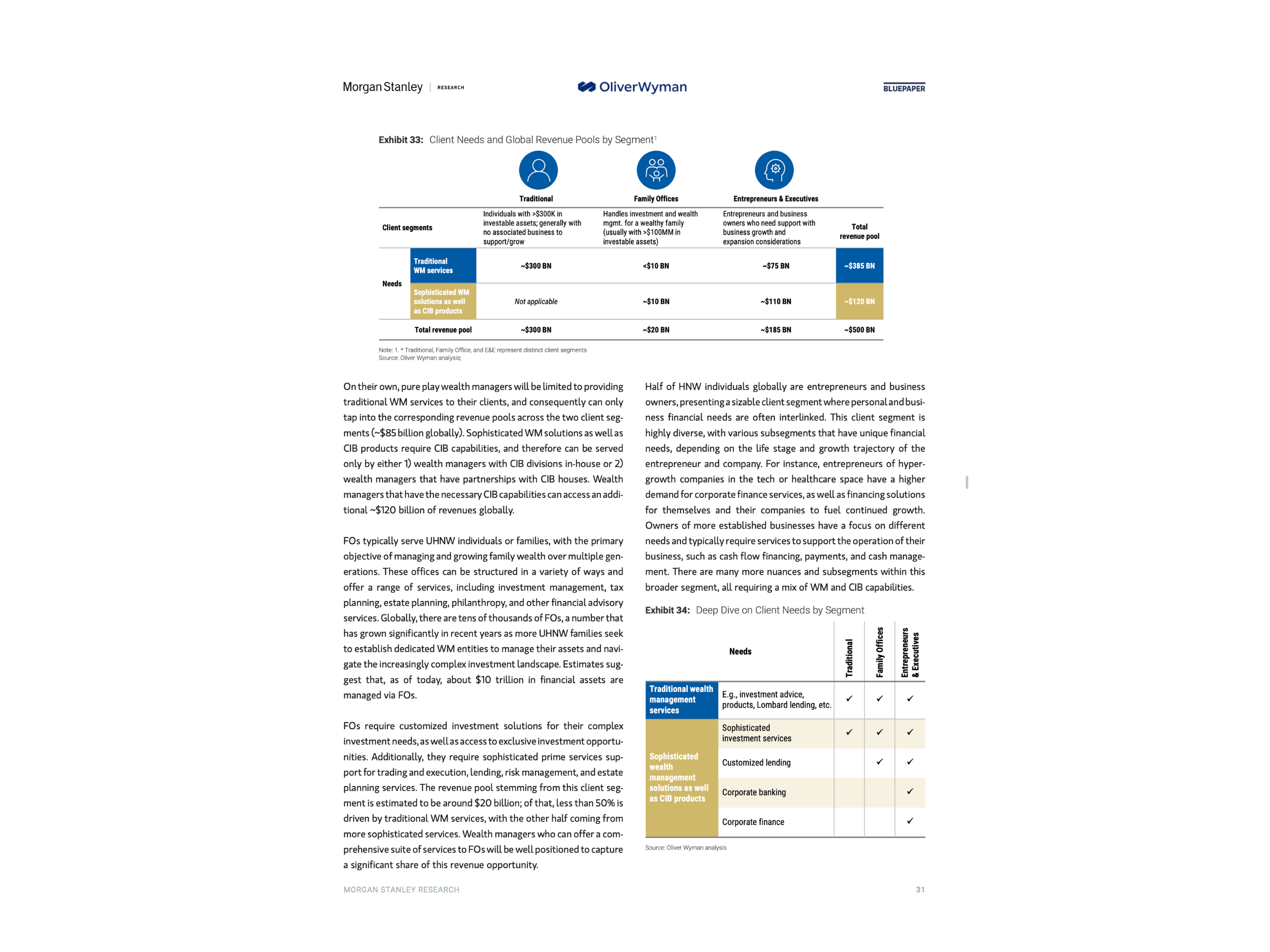
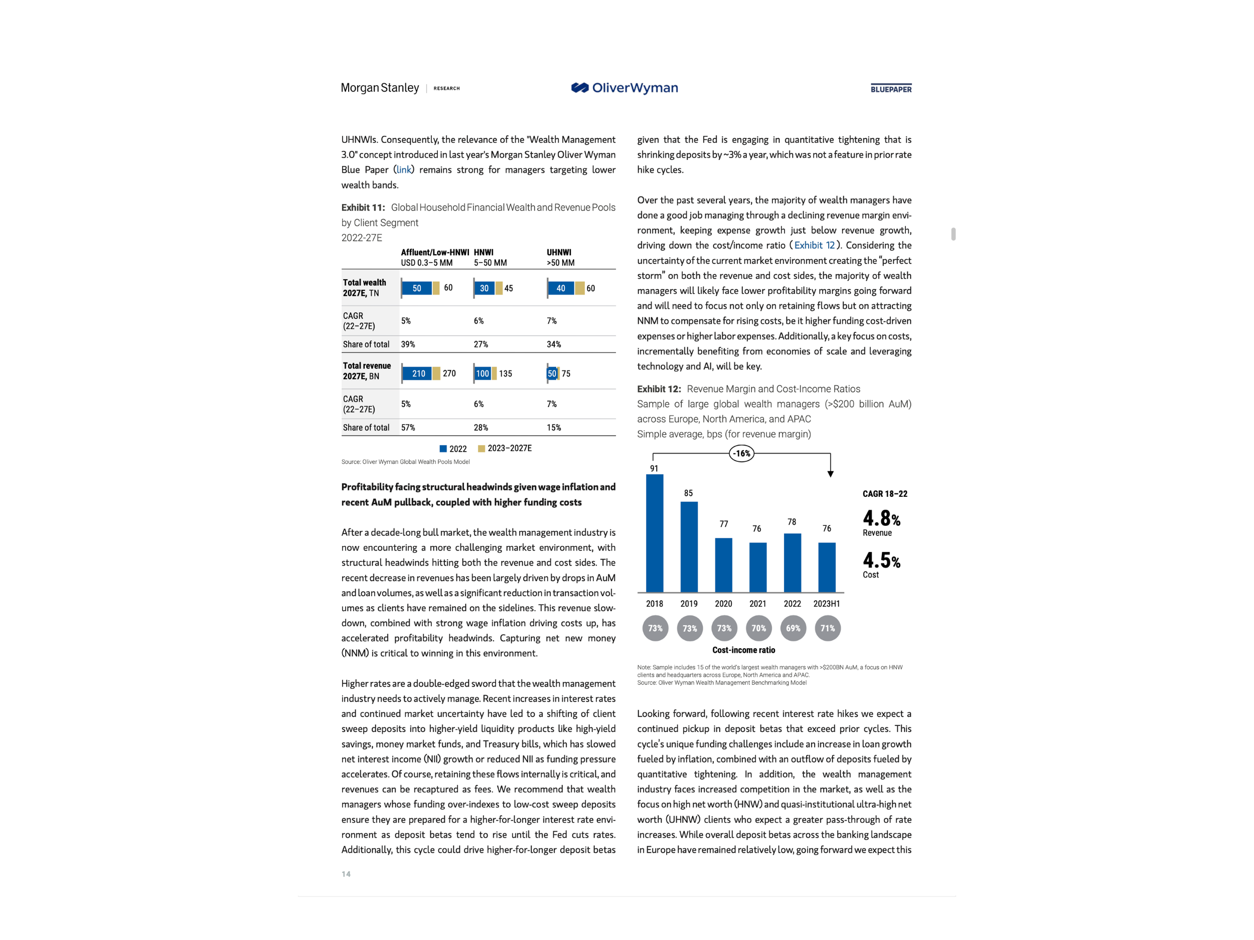
51 exhibits. One financial institution. Zero errors allowed.
Problem
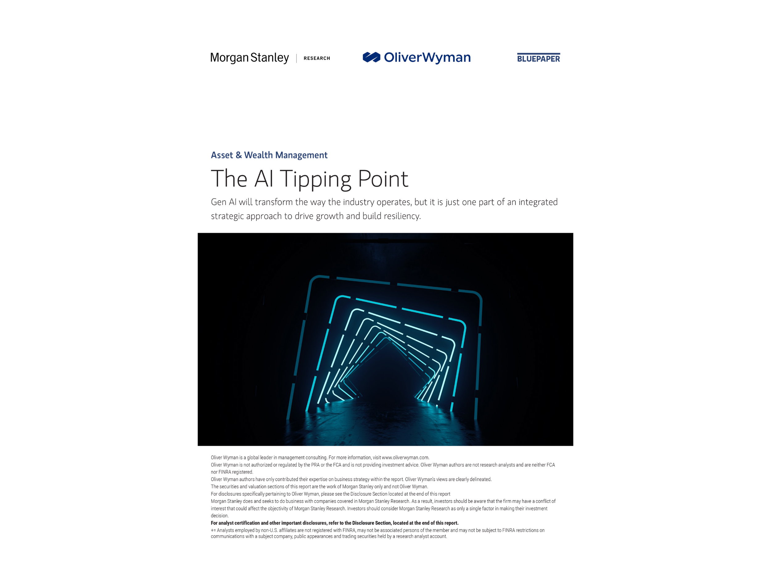
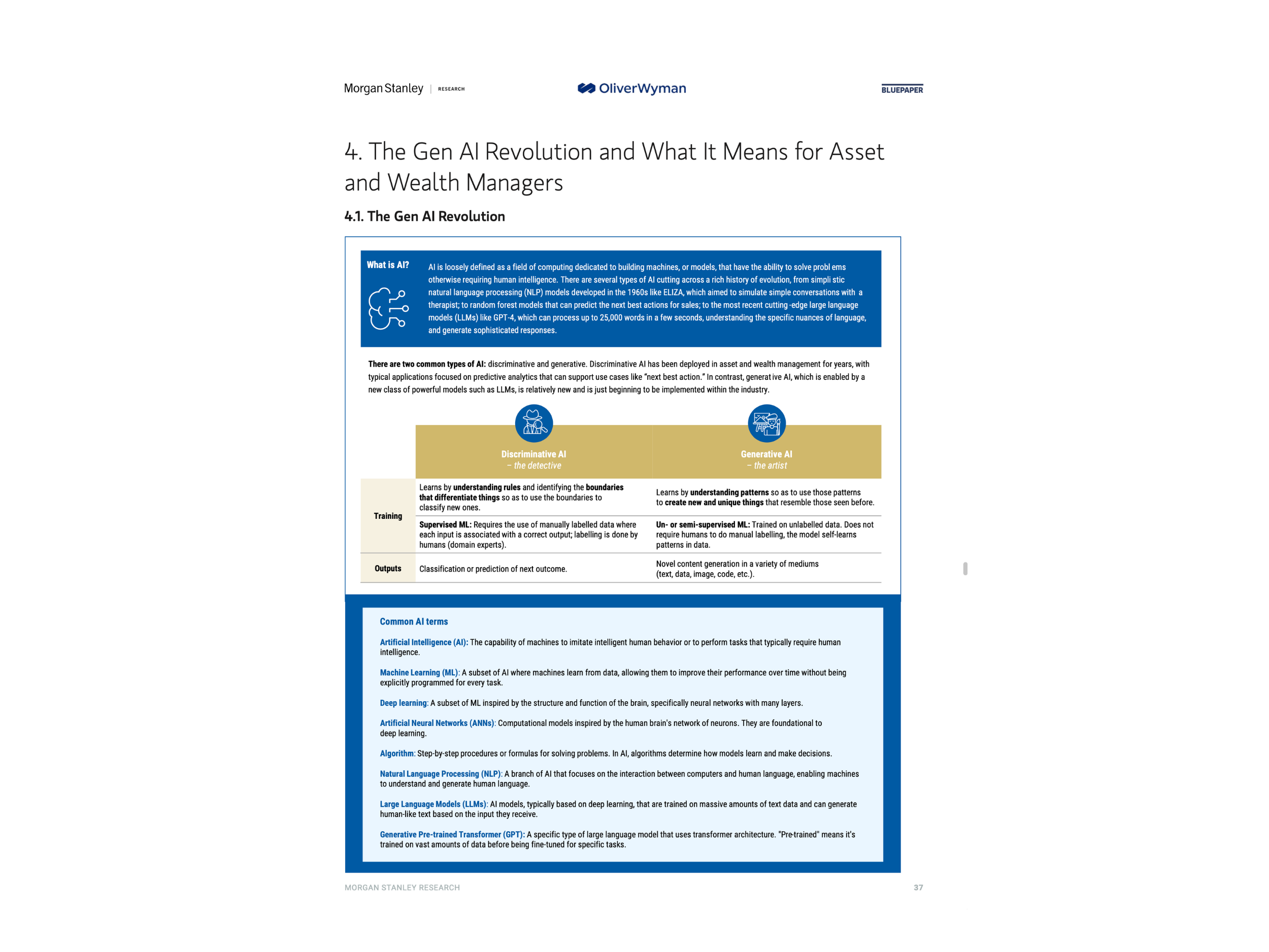
Morgan Stanley needed a definitive industry report via Oliver Wyman — 51 complex data exhibits, rigid brand rules, and a publication deadline measured in days. Raw Excel data arrived unstructured. Every chart required interpretation before a single pixel moved.
Approach
Treated charts as reusable components, not individual illustrations. Built a standardized charting language in Think-Cell before production began — axes, labels, and color logic locked first. Ran a rolling review process to catch errors before they compounded.
Results
The Production Engine
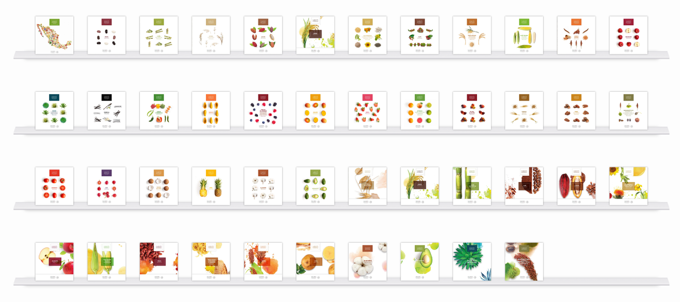
66 publications. 32 states. Built as a system, not a stack of files.
Problem
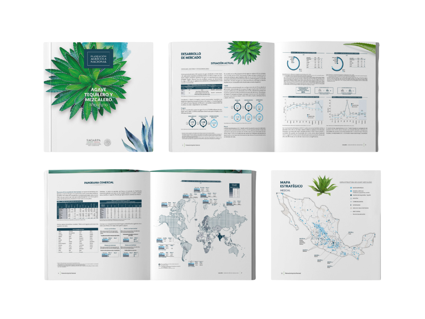
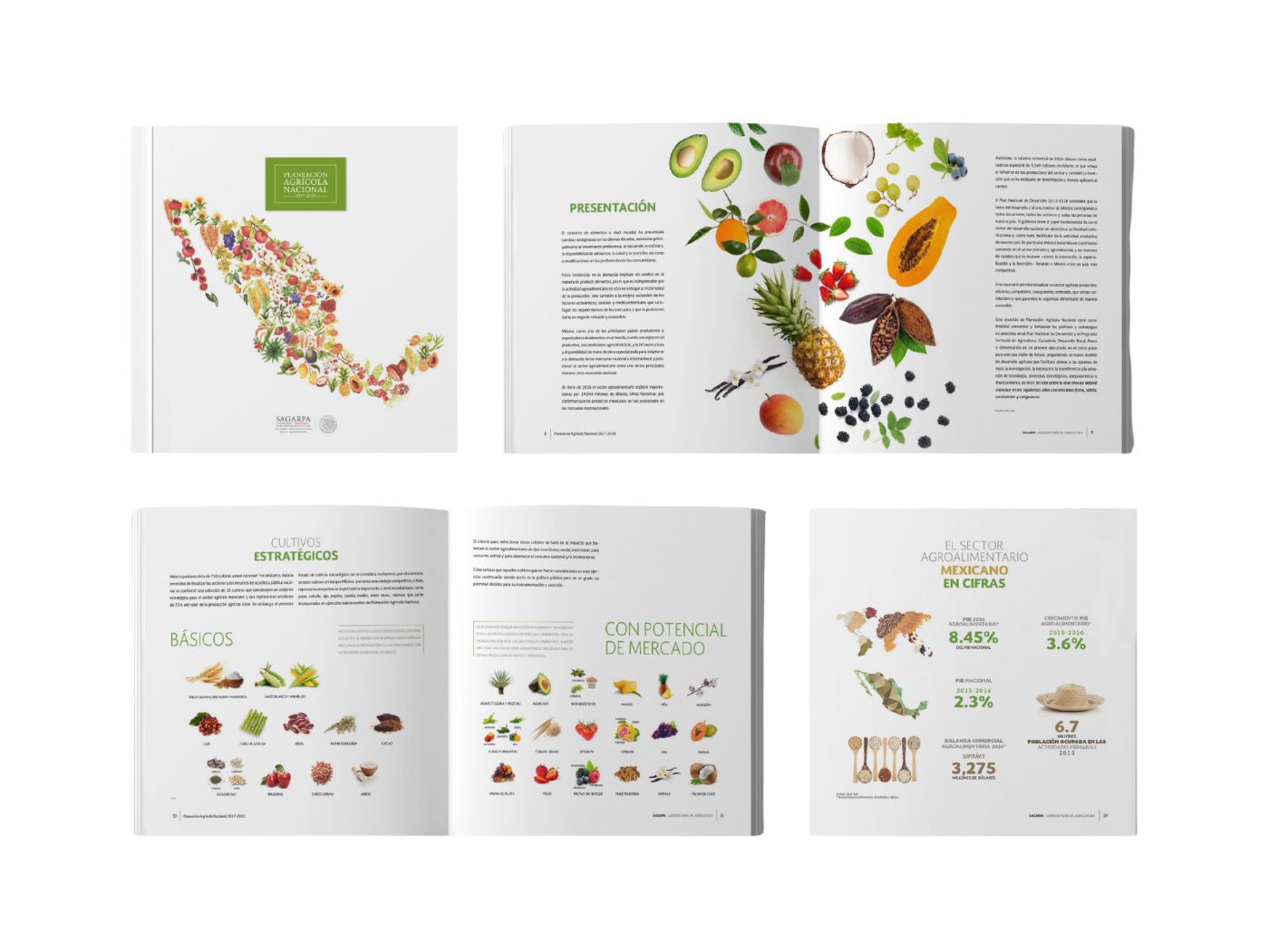
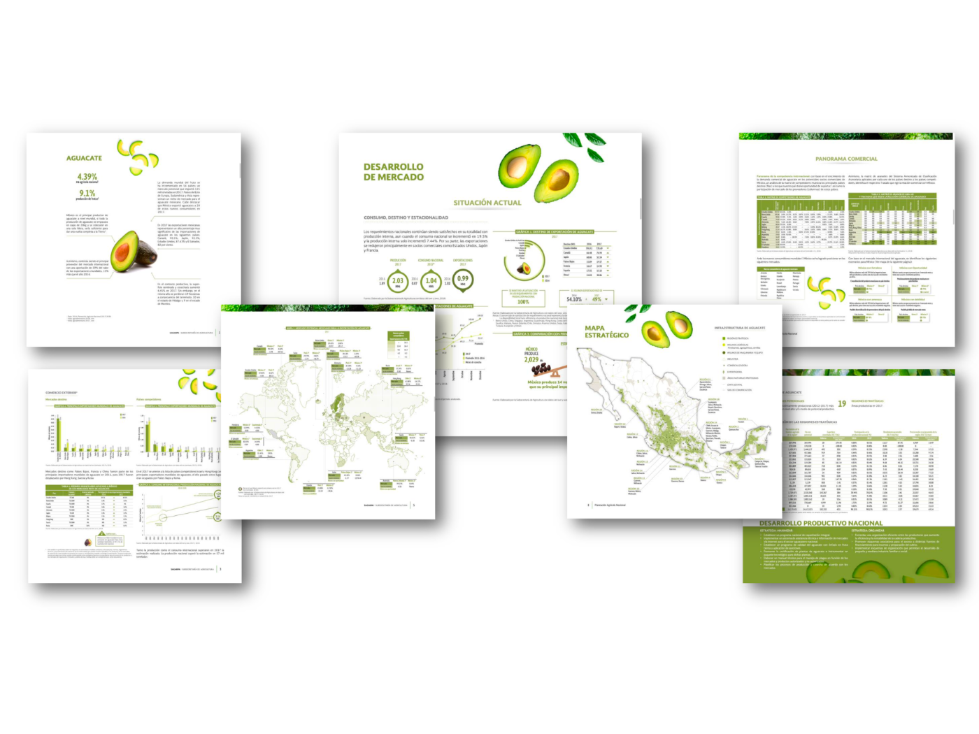
A federal initiative requiring 2 core editions plus 64 distinct booklets — each covering a different crop and region, produced simultaneously, for an audience of federal policymakers, investors, and agricultural leaders nationwide. Manually impossible within the government's deadline.
Approach
Designed a system before designing a single page. Built a Master Narrative Framework with an identical user flow across every booklet — Introduction → Regional Data → Crop Specifics → Future Projections — decoupling design from content so batch production became possible.
Results


The Shift
200+ consultants. One standard. No enforcement required.
Problem
Decentralized teams producing off-brand, visually inconsistent reports — driving rework hours and eroding brand authority. Consultants treated design guidelines as a hindrance to speed. Strict rules had been tried. They had not worked.
Approach
Changed the governance model from policing to enabling. Made the right way the easiest way. Built guidelines that explained why each choice made the message land better — not just what to do. Gave teams pre-built assets that required minimal effort to populate.
Results
The Range
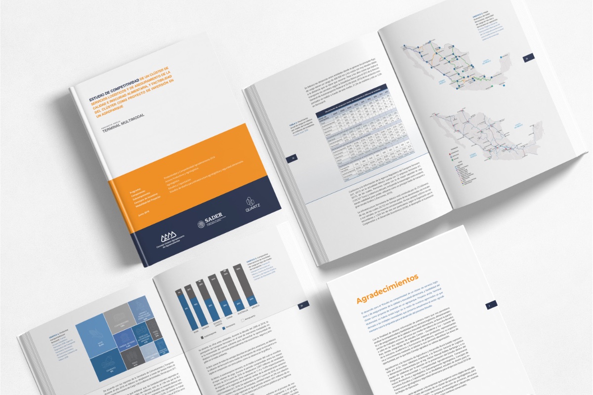
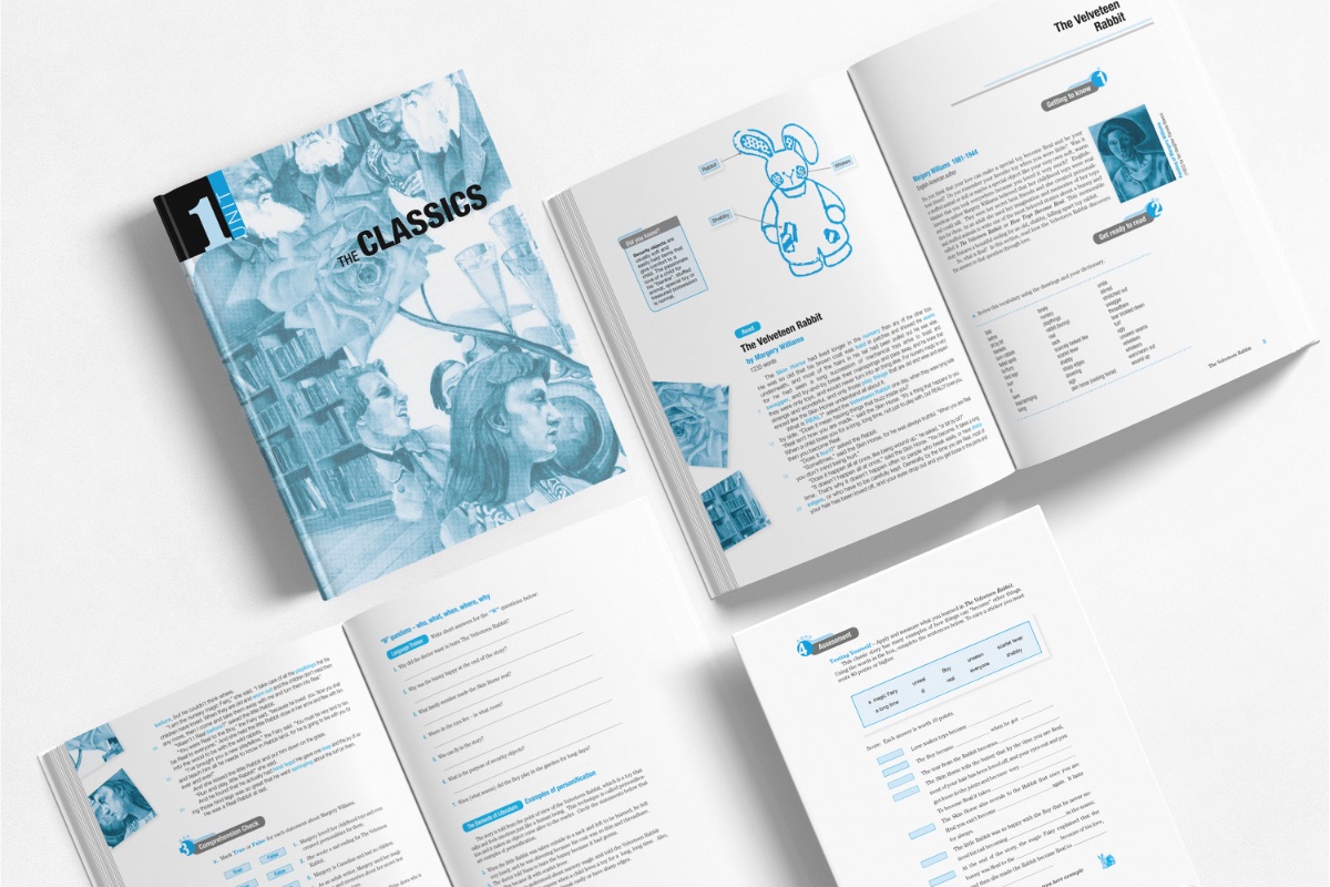
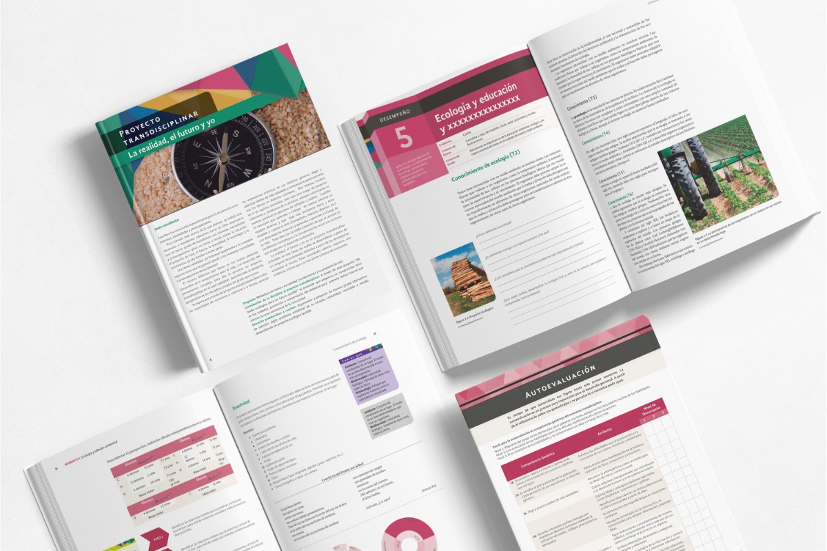
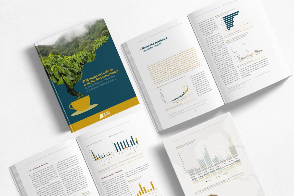
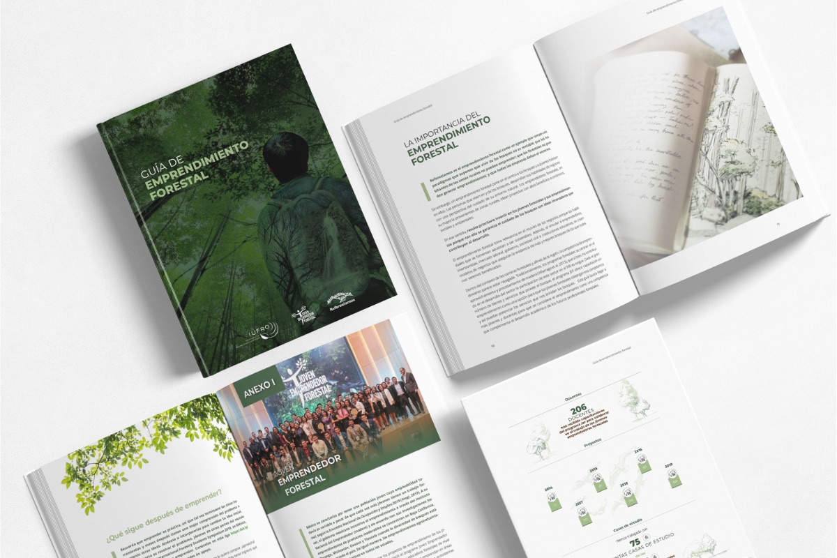
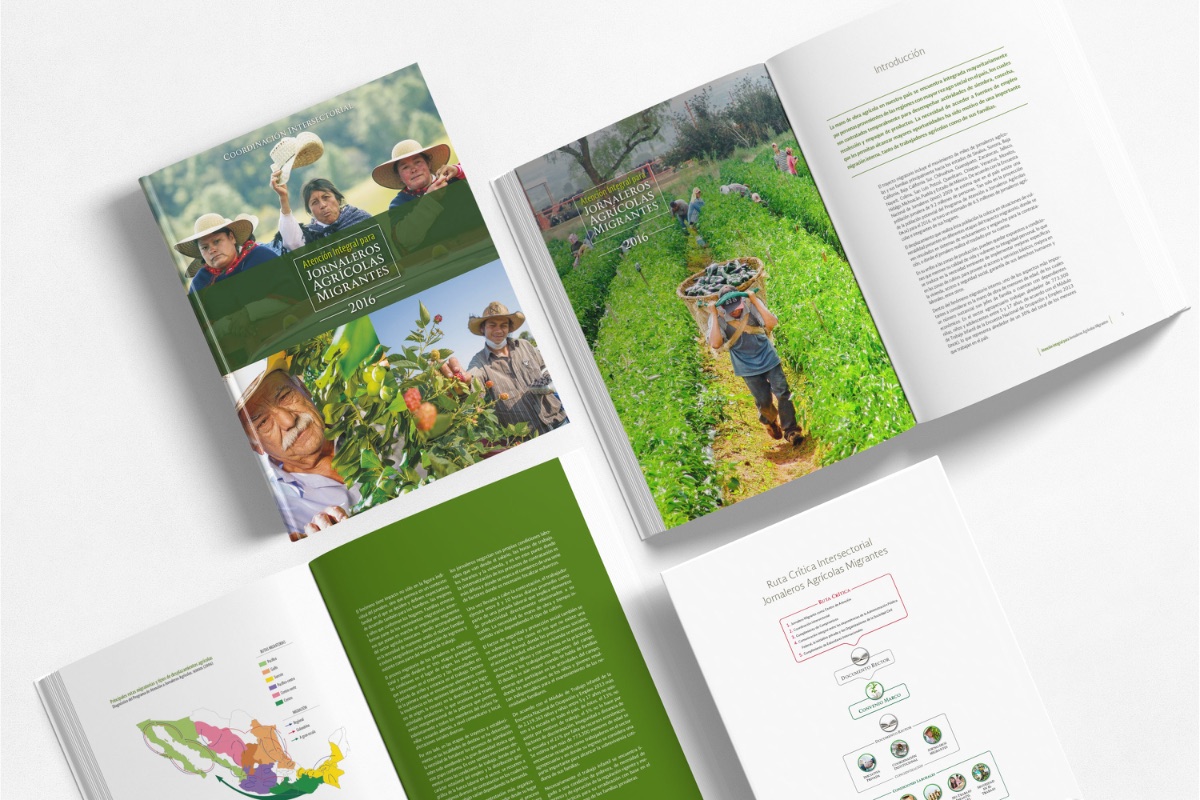
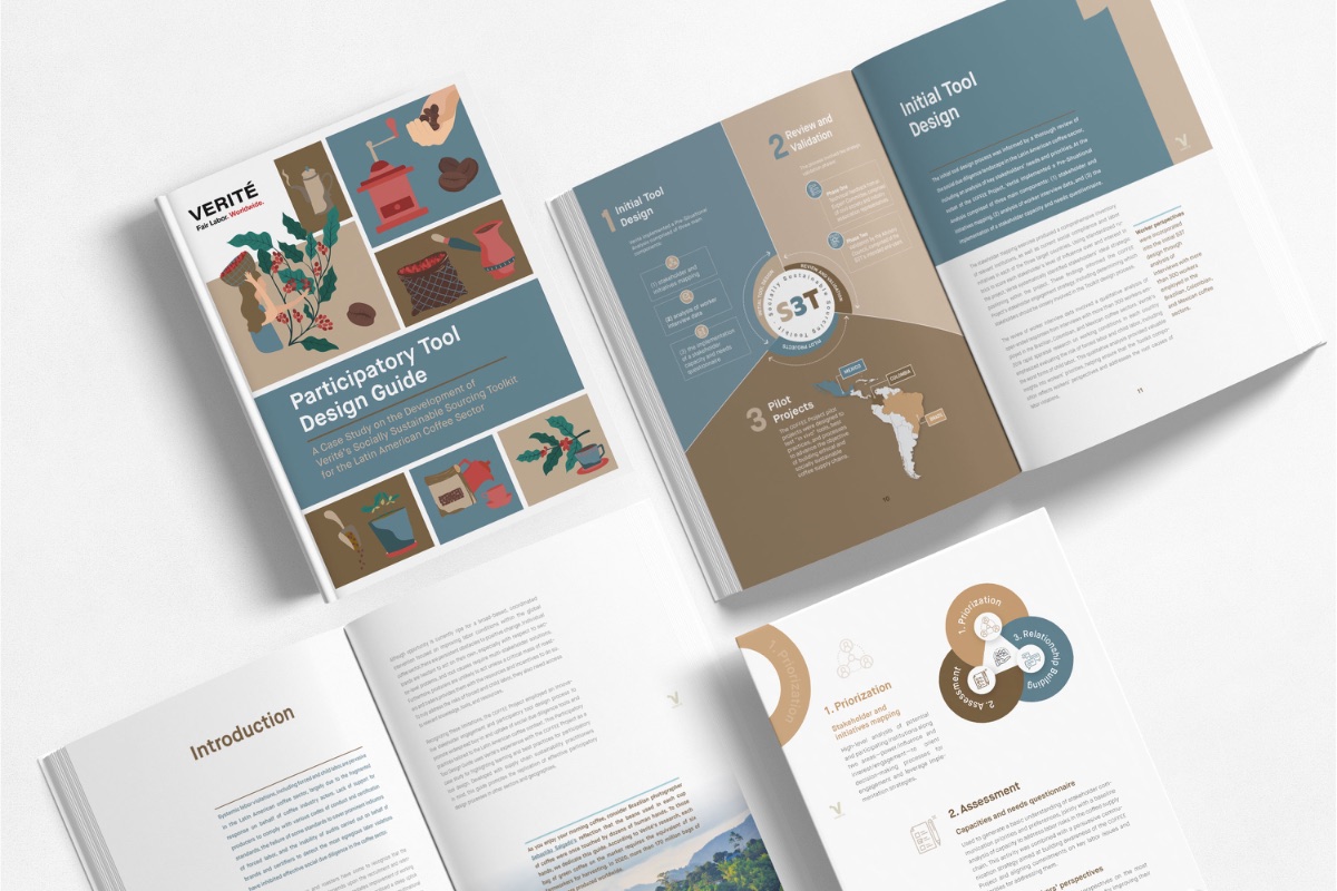
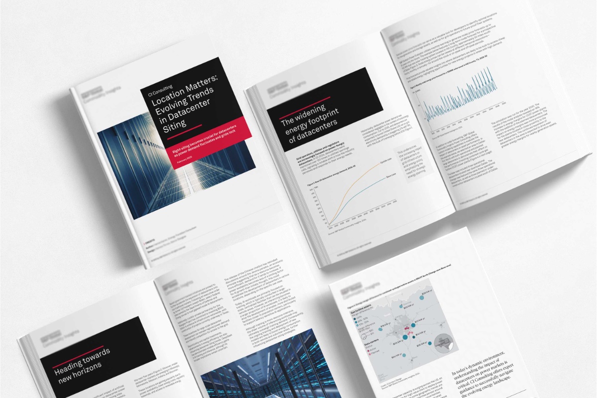
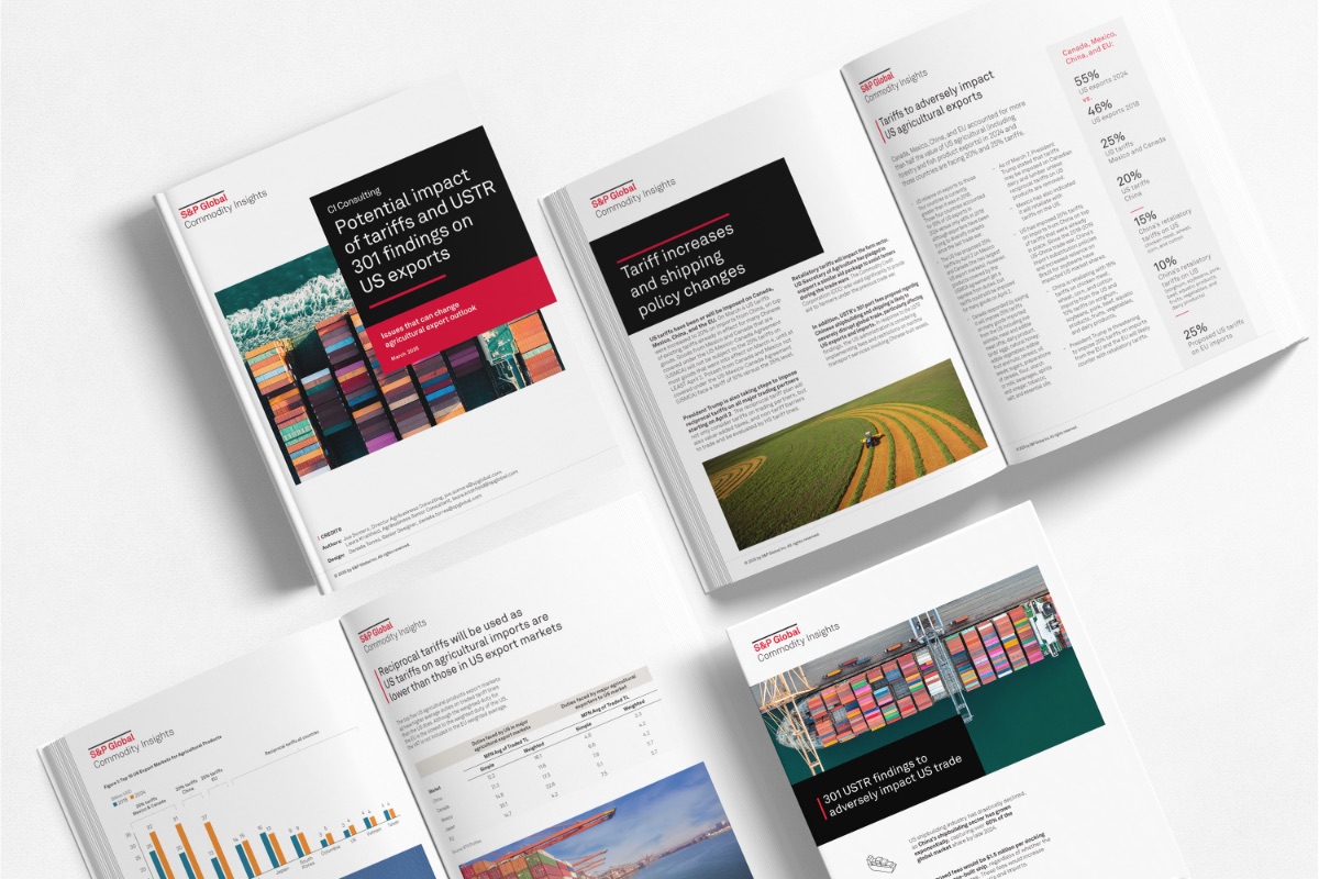
Ten publications. Four countries. No template inherited once.
Problem
Every engagement started from zero. Each client — a government agency, a multilateral institution, an NGO, a university press — brought a different audience, a different content density, and a different definition of professional. The challenge was not styling. It was inventing a complete visual language for each project from scratch.
Approach
Before layout, map the reader's journey. Build a grid that carries dense text chapters and full-bleed image spreads within the same document. Calibrate a typographic hierarchy for 100+ page reading sessions. Match every chart and infographic to the editorial tone of the publication. Deliver a documented style guide so the client owns it after handoff.
Results
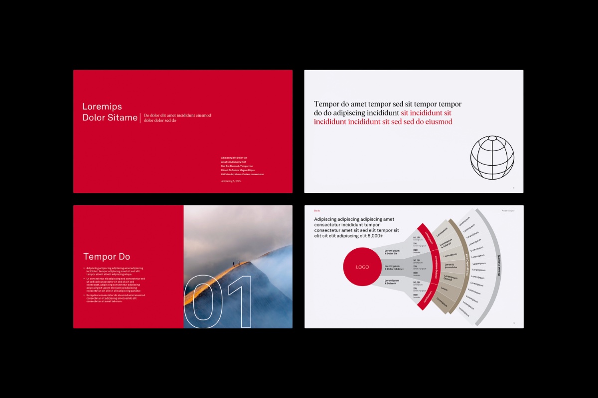
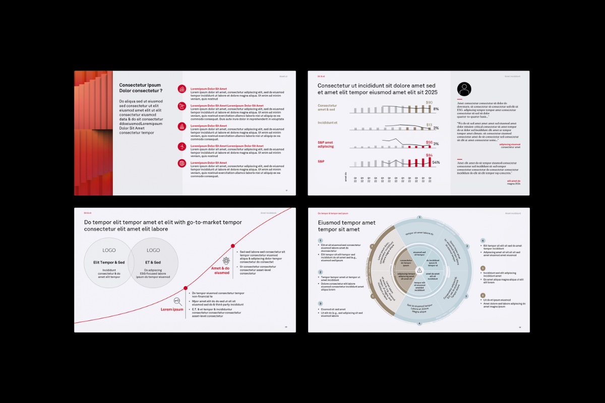
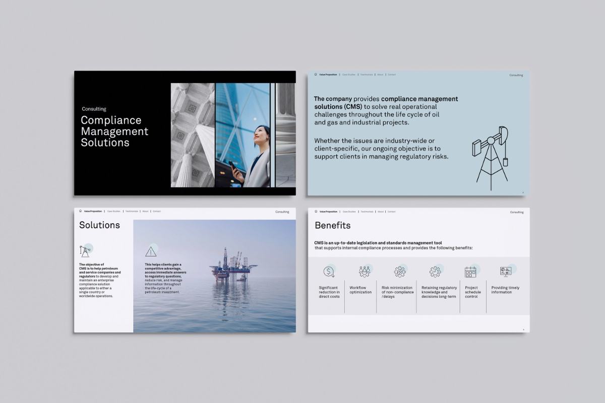
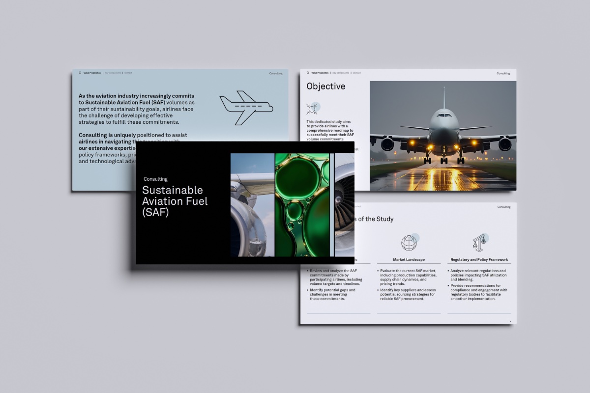
The Deck
Board-ready. Deadline-proof. Not one brand exception.
Problem
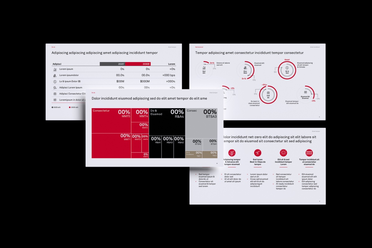
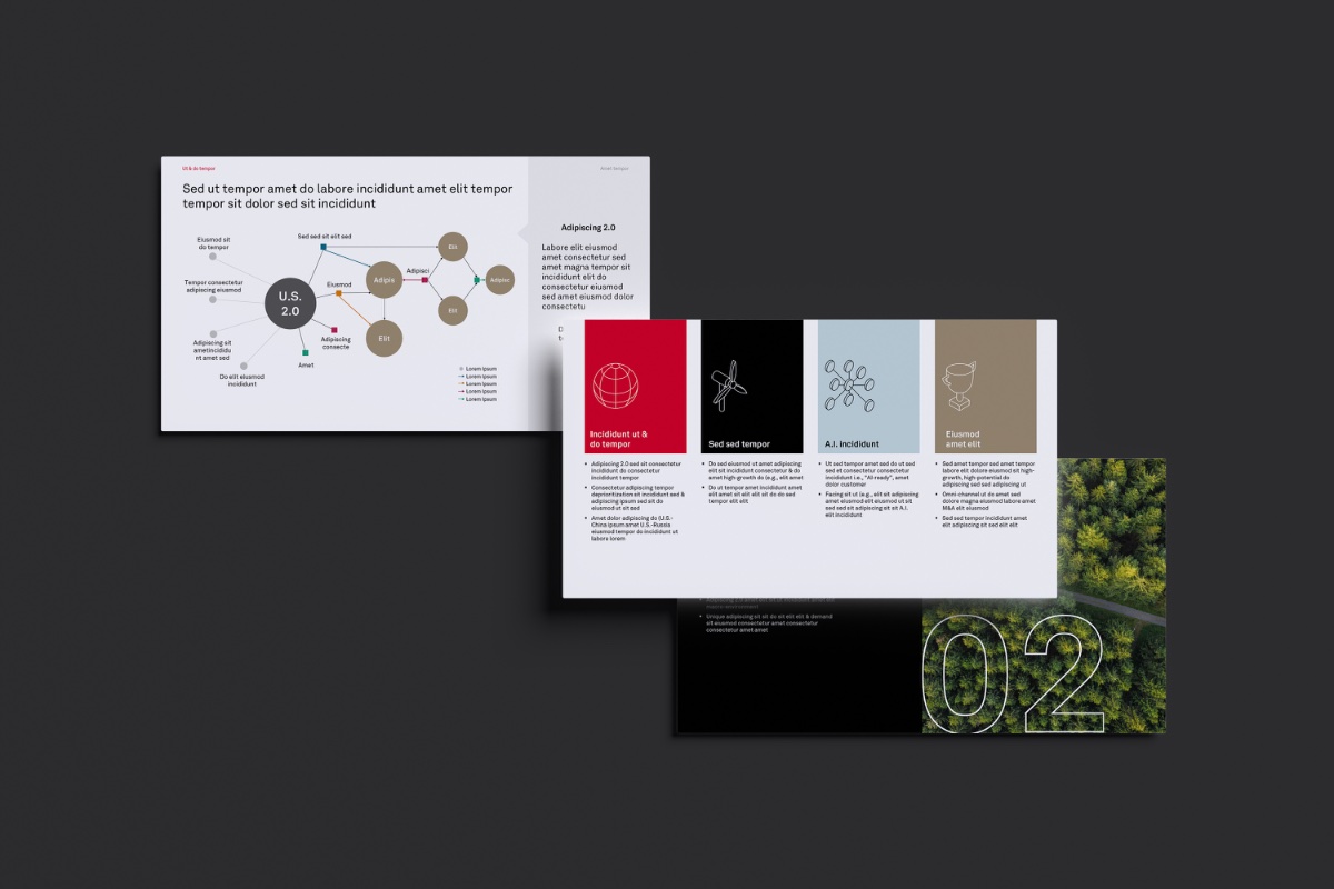
Consulting presentations break when slides from different contributors are assembled without a governing visual logic. Executive and board audiences read headlines — not bullets. A single misaligned axis or broken font signals that the argument itself is not under control.
Approach
Start with the narrative before opening PowerPoint. Identify what decision the deck needs to enable — then build backward. Lock modular layouts with fixed zones for headlines, data, and support. Standardize chart logic across every figure. Every headline carries the argument. Every visual proves it.
Results
The Signal System
144 rows of raw data. 4 executive audiences. 5 chart decisions. One live dashboard published on the internet.
Problem
Aurora's leadership team ran weekly business reviews from disconnected screenshots and ad-hoc charts across different tools. Numbers didn't align, formats varied, and the narrative got lost before any decision was made.
Approach
Started with the audience — CEO, VP Growth, Head of Operations, Data Lead — each with a different primary question. Aggregated 144 rows of raw data in Excel using pivot tables. Designed the complete visual system in Figma — color tokens, typography scale, chart grammar, narrative flow. Built each chart in Datawrapper with clean aggregated data. Used AI to generate the interactive dashboard code. Published via GitHub and Vercel.
Results
Eight more projects across my practice
Explore embedded project imagery from editorial, educational, digital, infrastructure, event, and brand assignments beyond the flagship case studies.
More about the practice
Detailed services, experience, products and field notes now have dedicated pages.